

.

articles/Fine-art/creativereproduction-page4
by Mike McNamee Published 01/10/2011
Exposure
Exposure needs to be exact but because of the static nature of the subject we have plenty of time to perfect it! The exposure should be set so that none of the highlights are clipping. This can be checked on the camera but it is more accurate to shoot a 1/3-stop bracket sequence and take the resulting RAW files to Photoshop for examination. The same is true for scans but the 'exposure' should be varied at the scanning stage. It is very difficult to place the exposure so that the exact level of highlight retention is achieved especially if there is slight unevenness in either the lighting or lens vignetting. A choice also has to be made as to where to pitch the background paper tone. For example, if a watercolour is painted on a creamy, 'natural' paper that is 'off-white', then it should be reproduced on a similar tone of paper. A contribution, from the file, of yellow ink is then not required, as doing so would apply a double dose of cream, once from the inkjet and once from the base paper. The trick is to lose the background tone of the paper while retaining the subtlety of the very light washes of a watercolour. You are unlikely to succeed right away and should be prepared to mask the paper white areas in the file so as to retain enough detail in the reproduced highlights. Do not be fooled by the use of even the best camera and printer profiling; they are likely to be defeated by the subtlety of the original and proofing is the only way to nail the thing down! The subtlety of the artist's washes should never be compromised. This is the part of the process where the photographer earns their keep - inexperienced printers and Photoshop users are unlikely to succeed at this phase of the task.
Calibration
This is linked to both the lighting and the camera conditions, both of which have their own characteristics but also complicate matters with their interaction. For example, our 105mm f2.8 VR Micro Nikkor has a radically different colour temperature shift when compared with our older 105mm Micro Nikkor. Some form of calibration target is required, usually a Macbeth ColorChecker (24 patch) or ColorChecker SG (140 patch). They are, at best, a compromise because none of the colours is likely to be perfect mimic of the artist's pigments that are being reproduced, particularly in regard to metamerism. They are , however, the only game in town so we have to run with them. The difficulties introduced by metamerism of pigments is one reason why calibration is a necessary but not sufficient requirement; it is likely that some tweaking will be required in Photoshop to differentiate colours which appear slightly differently in an original but are presented as the same in an image file (see call out on metamerism).
Another feature of camera calibration is the choice of RGB colour space. Using RAW files and 16-bit ProPhoto RGB files is the method of choice and the only real way to encompass the gamut of acrylic pigments and get it out into an Epson HDR inkjet print.
The choice of calibration software lies between i1 Publish (or a variant), X-Rite Passport, or the free, ACR Calibrator. Our preference is ACR Calibrator but many might find it a bit geeky and X-Rite Passport is both simpler and faster.
How good are your eyes?
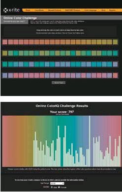
It is useful to know how good your eye-sight is and how well you are able to discriminate colour differences. X-Rite have recently placed the Farnsworth Munsell D100 test on line (http://www.xrite.com/ custom_page.aspx?PageID=77). This requires you to arrange four sets of 25 coloured chips in the correct order of changing hue value. A final score is then computed at the end (the test takes about 15 minutes to complete). Low scores are better and it is possible to score zero if your eyes are perfect. The scores can range up to many hundreds, but 68% of the population score between 20 and 100 points. Superior performance is defined as better than 16 points (you will be relieved to know that your editor (who is also a judge btw) scores 3 almost every time - there are two cyan patches that catch him out). The screen grabs show the way the test is displayed, the top row have been correctly arranged and show as 'zero errors' in the score chart.
A worrying aspect of the data is that analysis shows that quite a lot of people are lurking out there with inferior colour discrimination (you might expect 50% of the population to score around 46 points, only 10% will score better than 12 points). You might want to bear this in mind if you get involved in arguments over colour; knowing exactly where you stand might be quite empowering! Conversely it might push you to taking up monochrome photography!
There are 0 days to get ready for The Society of Photographers Convention and Trade Show at The Novotel London West, Hammersmith ...
which starts on Wednesday 14th January 2026


Society of International Commercial and Industrial Photographers (SICIP) is a trading name of BPPA Ltd
The Society of Photographers
Clwyd Chambers, Clwyd Street, Rhyl, Denbighshire, LL18 3LA
BPPA Ltd Company Reg 0392 2894
VAT number 790 4289 05
Tel: +44 1745 356935


Home Page - Find a Photographer - Benefits of Membership - Professional Imagemaker Magazine - FREE information pack - Privacy - London Photography Show Europe's Largest 'All-Welcome' Photographic Convention
Newsletter
Subscribe to the Societies Newsletter. Subscribe here.