

.

articles/Monitors/projectors-page3
by Mike McNamee Published 01/04/2009
Restricting the choice to 4:3 format projectors reduces the candidate projectors to 41. If you then eliminate all DLP projectors on principle, the number drops again by about 50% - we had no way of knowing exactly with the database we were using.
Matching the Graphics Card and Projector
This is a topic that does not get a lot of discussion. If your editor's experience is anything to go by it is vital. My own laptop is an SXGA+ format (1400x1050 pixels). Using any resolution either side of this value severely compromises the quality of the output to the laptop monitor.
Indeed, the loss of sharpness as you move to the lower resolution is exactly counteracted by the change of icon size due to the resolution change. This brings problems when it comes to projection. Most projectors are happiest at 1024x768 pixels resolution whereas my laptop graphics card likes 1400x1050, a 'no win' situation. A number of the federations that govern the enthusiast competitions have adopted SXGA+ as an additional, acceptable standard. How this will impact upon images projected at a downscaled 1024 SGA format is an unknown quantity, if your editor's experience is anything to go by it will be poor quality. The move is to a certain extent governed by the popularity of the Canon projectors available at SGA+ (in say the XEED SX60). It is noteworthy that although there is a 1024x768 pre-set in the Photoshop File>New dialogue box there is not one for SGA+ - perhaps the situation will change as Adobe cotton on to the moves in the clubs.
The on-screen quality can be further compromised by use of keystone correction. Of interest here is the directive from the Photographic Alliance of Great Britain that keystone correction should not be employed when projecting images in competitions under their jurisdiction. To some extent it depends on just how the correction is made. With only 1024 pixels to play with, any interpolation to change the shape can be detrimental. Far better are the optical corrections made via the glassware. Lifting the projector up to centre screen level* brings in a number of issues in regard to visibility for an audience as the throw of most projectors is short (ie they need to be close to the screen).
The wide-screen laptops add further complication resulting sometimes in partial screen coverage to either projector or laptop screen or, even worse, everything on screen being squashed into the format. The moral of the story is to think hard about the various formats that you employ and decide which should be the overriding factor, then purchase
accordingly.
*This is not centre-screen level, most projectors have built-in optics such that placing the projector about a fifth of the way up the screen renders a geometrically rectangular image which covers the screen.
The Screen
You should avoid the more sophisticated 'beaded' screens - they can create very distracting moire fringing. The plain matt white screen is much preferred for digital projection and a painted wall will suffice for many applications.
In Practice
It is difficult, indeed almost impossible to check out a projector before you purchase one and the staff at most non-photographic outlets are likely to display a disappointing ignorance of the requirements for our applications. We can only report on what we have found with the Epson 1810 as this is a projector we have experimented with. Here is what we found:
The greatest discussion that you hear when digital images are being projected in whether or not this or that highlight has been blown out.
A key measurement when viewing a projector should be the point at which differentiation no longer occurs between highlight detail. To do this we use the 'highlight' detector of our standard colour audit test chart. Next comes the shadow detail retention as measured by the 'shadow detector' in our audit chart. Both measurements are influenced by the projected image size and we blow up the portion of the target when viewing it. The differentiation at full-screen-zoom sizes is far less, and the ability to differentiate from the back of a hall is far less than if you are sitting in the front row. In terms of colour, the skin tones are usually critical and influenced by the selected colour temperature.
We started by projecting in a fully darkened domestic room with the projector at factory defaults, which included zeroed settings for Brightness, Contrast and Sharpness. The chosen colour temperature was 6500°K and the sRGB setting for colour space. The shadows were differentiated down to 15 RGB points, a value that went up to 25 RGB points (ie worse) with subdued room lighting (of about 80lux - for reference this is the level most people might use when eating dinner or viewing their television; office lighting is usually about 200 lux). The highlights were differentiated up to 246 RGB points, a reading that was unaffected by switching on the room lights. Changing the projector from sRGB mode to Photo mode did not affect any of these readings.
Next we adjusted the projector contrast and a setting of -19 brought the highlight differentiation up to 252 RGB points (where we would like it to be) while retaining the 15 point RGB shadow differentiation. At this stage we also adjusted the sharpness setting, deciding on a value of -2, although it was not a very critical change.
Using the settings above we profiled the projector using the GretagMacbeth Eye One and Beamer using Eye One Match. We choose a gamma of 2.2, a colour temperature aim point of 6500°K and then profiled the set-up. This retained our shadow and highlight values of 252 and 15 RGB points but we considered that the skin tones were a little too saturated.
We then 'reset' the projector and profiled again. Without further adjustment this gave shadow detail down to 10R GB points and highlight differentiation up to 250 RGB points. Although the skin tones were attractive, they were a little 'hot' for our taste and putting the colour temperature up from 6500°K to 7000°K reduced the saturation (as it forced everything a little more blue, ie cooler). We then dropped the projector contrast setting to -10 units which brought the highlight separation to 252 RGB points and produced shadow separation at 5 RGB points. This is slightly better shadow separation than we achieve with a profiled print, which rarely separates shadows at better than 15 to 20 RGB points without intervention.
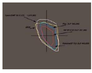
The gamut volumes were measured on the profiles at 993,808 for the first settings and 1,002,423 for the last set. These values are very close to those we measured on the projector when we first tested it about 12 months ago, and in line with typical LCD values. They are much greater than DLP values.
Our experiments showed that it is worthwhile carefully examining the projected image and making adjustments to the settings of the projector even after it has been profiled. While this is counter-intuitive after you have paid out money for a projection calibration device/ software, it is what we found!
http://www.pagb-photography-uk.co.uk/misc-pdfs/standards_final.pdf
There are 0 days to get ready for The Society of Photographers Convention and Trade Show at The Novotel London West, Hammersmith ...
which starts on Wednesday 14th January 2026


Society of International Commercial and Industrial Photographers (SICIP) is a trading name of BPPA Ltd
The Society of Photographers
Clwyd Chambers, Clwyd Street, Rhyl, Denbighshire, LL18 3LA
BPPA Ltd Company Reg 0392 2894
VAT number 790 4289 05
Tel: +44 1745 356935


Home Page - Find a Photographer - Benefits of Membership - Professional Imagemaker Magazine - FREE information pack - Privacy - London Photography Show Europe's Largest 'All-Welcome' Photographic Convention
Newsletter
Subscribe to the Societies Newsletter. Subscribe here.