

.

articles/Dyslexics/dyslexics-page2
by Mike McNamee Published 01/12/2013
Find a better font
One of the common problems that dyslexic readers have is that individual letters 'move about' while being read. Typically certain letters are either reversed (flipped) or inverted, or both. The bp qp qb mw vw ij combinations are confused both in reading and writing. In order to combat this, a special font has been divised by Christian Boer of StudioStudio in the Netherlands. The font 'Dyslexie' is specifically designed with a heavy base to add 'stability' to the letter forms and prevent them from turning over. The ascenders to the letters are also emphasised to differentiate between say an n and an h. Also things such as the i and the j are designed to look different (by slanting) to prevent confusion. Similarly, the confusing letters bqpd are shaped to be more distinctive and the openings of letters such as c are enlarged. Using such a font improves the accuracy of dyslexic readers. The font may be exploited in several ways. Designers working on material to be read by dyslexics can use the font at the outset on things such as forms, instructional leaflets and general information reading matter.
Alternatively the dyslexic reader can change the default settings of their software to use Dyslexie as standard - typically this might include web browsers, email readers.
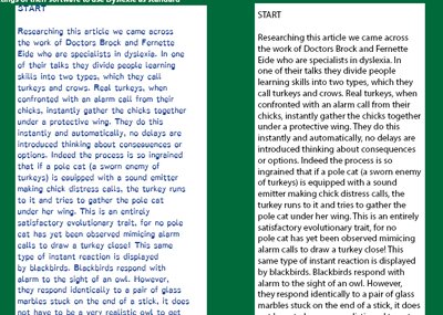
Word and other design programs. When either composing or setting words in a layout, the dyslexic designer might usefully prep stuff up using Dyslexie and then, confident that the wording was correct, do a global font change as needed. In a large design organisation the words are likely to arrive already proof read and corrected but there are still lots of occasions when a dyslexic needs to compose short documents, emails or letters. From a design point of view this leaves the dyslexic creative with a dilemma - they want to use a nicely balanced and interesting font but then cannot easily read it!Another tactic for dyslexics is to change their browser default font to Dyslexie so that it is always more easily read - the same could go for composing text in Word.Dyslexie on the left, Myriad Pro Regular on the right see http://www.studiostudio.nl/en/information/
There are 0 days to get ready for The Society of Photographers Convention and Trade Show at The Novotel London West, Hammersmith ...
which starts on Wednesday 14th January 2026


Society of International Commercial and Industrial Photographers (SICIP) is a trading name of BPPA Ltd
The Society of Photographers
Clwyd Chambers, Clwyd Street, Rhyl, Denbighshire, LL18 3LA
BPPA Ltd Company Reg 0392 2894
VAT number 790 4289 05
Tel: +44 1745 356935


Home Page - Find a Photographer - Benefits of Membership - Professional Imagemaker Magazine - FREE information pack - Privacy - London Photography Show Europe's Largest 'All-Welcome' Photographic Convention
Newsletter
Subscribe to the Societies Newsletter. Subscribe here.