

.

articles/Printing/abw-page6
by Mike McNamee Published 01/08/2012
The plot from which the data used to create the statistical (regression) analysis on the left was made.
Maths for Colour Geeks
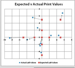
Based on an analysis of real prints we computed the expected effect of changes to the ABW settings. In the graph the red squares are the expected values (based on the regression analysis on the right). The blue diamonds are the measured values off a Canson Baryta Photographique print. The best we can say is that the data points arrange themselves in the correct order and locations. There are, however, annoying variations, the greens for example are twice the expected value
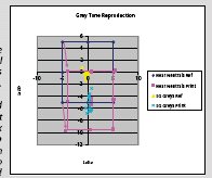
The issue of brightened papers in a nutshell. This very bright paper has driven the grey's matrix (blue box) downwards by 10 Lab points (pink box), a larger shift than the bias values we are trying to introduce - just on the paper!
The regression analysis of the ABW settings against measured outcome is an attempt to find the scaling factor between them. The slope of the line is almost exactly 0.1 (0.0996 to be precise) which puts the scaling factor at 10x. The statistical fit is rather poor an R2 value of 0.74 is nothing to write home about (it improves to 0.94 if you remove the outliers from the analysis but that is cheating). Having run out of paper we were unable to refine the calculations.
There are 0 days to get ready for The Society of Photographers Convention and Trade Show at The Novotel London West, Hammersmith ...
which starts on Wednesday 14th January 2026


Society of International Commercial and Industrial Photographers (SICIP) is a trading name of BPPA Ltd
The Society of Photographers
Clwyd Chambers, Clwyd Street, Rhyl, Denbighshire, LL18 3LA
BPPA Ltd Company Reg 0392 2894
VAT number 790 4289 05
Tel: +44 1745 356935


Home Page - Find a Photographer - Benefits of Membership - Professional Imagemaker Magazine - FREE information pack - Privacy - London Photography Show Europe's Largest 'All-Welcome' Photographic Convention
Newsletter
Subscribe to the Societies Newsletter. Subscribe here.