

.

articles/Printing/abw-page7
by Mike McNamee Published 01/08/2012
CONCLUSIONS
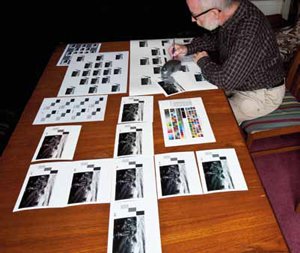
This has been one of our more complicated escapades! The test series indicates that it is possible to achieve a very good representation of the expected result from a given ABW setting and to display this accurately on high-end monitors.
The use of custom soft proofing and the simulation of the paper base tone is essential to this outcome.
Judgement of the shades of grey proved to be tricky even though the eye is most sensitive in this region. One piece of good news is that when we made test arrays onto brightened paper the eye accommodated so well that yellow biased attempts looked yellow even when the measurements of the grey suggested they were almost neutral. As expected the eye was perfectly adapting to the surrounding cool white borders and thus 'seeing' the neutrals as a little yellow.
In terms of settings we suggest that it is only worth dealing in increments of 10 units in the ABW Color Wheel, anything less will almost certainly be lost. So, if you make a print and decide you want it more toned, bang in at least 10 more points or more likely another 20 points. From a neutral starting point we would suggest that a 20 point change might be used to correct a subtle bias and that a 50 point change should be used to create a distinct (ie deliberate) tone effect.
There are 0 days to get ready for The Society of Photographers Convention and Trade Show at The Novotel London West, Hammersmith ...
which starts on Wednesday 14th January 2026


Society of International Commercial and Industrial Photographers (SICIP) is a trading name of BPPA Ltd
The Society of Photographers
Clwyd Chambers, Clwyd Street, Rhyl, Denbighshire, LL18 3LA
BPPA Ltd Company Reg 0392 2894
VAT number 790 4289 05
Tel: +44 1745 356935


Home Page - Find a Photographer - Benefits of Membership - Professional Imagemaker Magazine - FREE information pack - Privacy - London Photography Show Europe's Largest 'All-Welcome' Photographic Convention
Newsletter
Subscribe to the Societies Newsletter. Subscribe here.