

.

articles/Printers/canonpro9500-page5
by Mike McNamee Published 01/06/2010
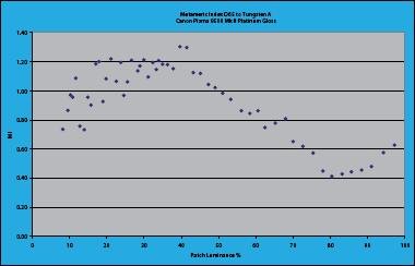
Having got our bearings we took a look at the Platinum glossy paper, the Canon flagship for this style of media. It has a higher gloss level than the Pro II paper and is quite a bit brighter. This is achieved by the use of OBAs which shifted the white point to about -5 lab b points, lifted the base brightness to 103% (the highest we have measured) and gave a lift at 440mn to 116%, ie 13% above base white. The built-in profile delivered a rather weak audit chart that was 6% too light and with a top Dmax of just 1.6 points. Shadow detail was particularly well differentiated within the weaker environment. Subsequent testing indicates that you should use 'Printer Manages Color' rather than the 'Photoshop Manages Color' setting we always use with Epson printers. This setting takes away the ability to use icc profiles but in that case the Dmax is determined by the profile itself.
We tried to obtain a second opinion on the audit data by taking profiles made by Moab for their Colorado Fibre Satine media on both the Epson 3800 (not the 3880) and the Canon 9500 Mk II. We also retrieved the Moab samples from our archive and got the data out of the archive also.
The Canon print was visually weaker than the Epson and this was a mimic of the gamut volume data:
Examining the print, the Canon was lighter overall with better shadow separation. The skin tones were lighter, less saturated and pinker on the Canon. The Granger Chart of the Canon was much smoother in the transitions of the blue part of the gamut. Banding found from the profiles for the Epson was not present in the profile for the Canon (probably a MOAB issue not a printer issue).
The data were up and down, with the Epson and Canon trading blows in various parts of the gamut. The pair of histograms illustrate the bulk of the audit data. At the top the Epson has a higher error in Lightness component (the bottom of each block, coloured light blue). The bottom histogram, for the Canon, has a much reduced lightness error but some (though not all) of the saturation errors are higher. Taking just the skin tones, the 3800 is better on saturation and hue but poorer on lightness error.
The overall error is better for the Canon, 2.66 plays off 3.56 for the Epson. Surprisingly, and despite the good Granger Chart, the Canon does not win the battle in the blue area of the gamut, Epson inched ahead via the lightness channel in that area.
At the end of the analysis the result remained a draw and any variations might be reversed with different medias. All the errors are low and require careful comparisons to spot differences.
There are 0 days to get ready for The Society of Photographers Convention and Trade Show at The Novotel London West, Hammersmith ...
which starts on Wednesday 14th January 2026


Society of International Commercial and Industrial Photographers (SICIP) is a trading name of BPPA Ltd
The Society of Photographers
Clwyd Chambers, Clwyd Street, Rhyl, Denbighshire, LL18 3LA
BPPA Ltd Company Reg 0392 2894
VAT number 790 4289 05
Tel: +44 1745 356935


Home Page - Find a Photographer - Benefits of Membership - Professional Imagemaker Magazine - FREE information pack - Privacy - London Photography Show Europe's Largest 'All-Welcome' Photographic Convention
Newsletter
Subscribe to the Societies Newsletter. Subscribe here.